Most landing pages fail not because they look bad, but because they do not ask the right thing at the right moment.
Your page looks “nice”, but does not convert. Here is the uncomfortable truth: you have designed a page, not a decision. This is where landing page design for conversions differs from regular design. Let us break down what actually works today, not theory, but what high-performing brands are doing right now.
Landing pages don’t fail slowly. They lose people in the first few seconds.
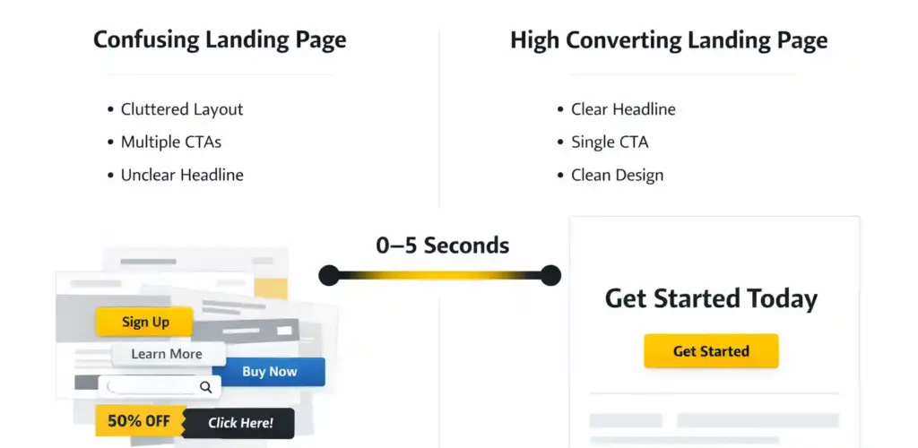
If your message isn’t clear instantly, your traffic is already wasted.
Look at your current landing page. Would a first-time visitor understand it in 5 seconds?
Quick test: Can your site visitor explain what you do after just seeing your headline?
Because if this is not clear yet, nothing else on your page will matter.
1. Above the Fold = Decision Window (landing page design for conversions starts here!)
You have 3–5 seconds. That’s it. Users don’t “read” your landing page anymore; they scan for relevance.
So your headers should instantly answer:
👉 “Is this for me?”
👉 “Is this worth my time?”
Bad:
“Welcome to our services”
Better:
“Generate qualified leads without spending more on your ads”
💡 What do you think is working now?
- Outcome-first headlines
- Sub-headlines that remove friction
- Micro proof (logos, stats) above the fold
Did you know pages with clear value propositions see up to 2.5x higher conversion rates?
2. Brand Marketing Services Shift: “Why You?” Not “What You Do”
Most brands talk about themselves. High-converting pages talk first about the user’s problem.
Your value proposition should feel like: “Oh, finally, someone gets it.”
Instead of:
“We offer brand marketing services”
Try:
“Your campaigns are getting clicks, not customers. Let’s fix that.”
This is where brand marketing services need repositioning:
- From deliverables → to desired outcomes
- From features → to friction solved
3. Heard of the High Converting Landing Pages Rule? One Page. One Action.
If your page has:
- Book a call
- Download brochure
- Explore services
- Follow us
…you have already lost.
High converting landing pages remove choice!
Your CTA should:
- Be singular
- Reduce hesitation
- Be repeated (not varied)
Examples:
- “Get Your Free Strategy Call”
- “Check What is Not Working in Your Funnel”
Add microcopy like:
- “Takes 30 seconds”
- “No commitment”
Too many choices don’t help users — they confuse them.
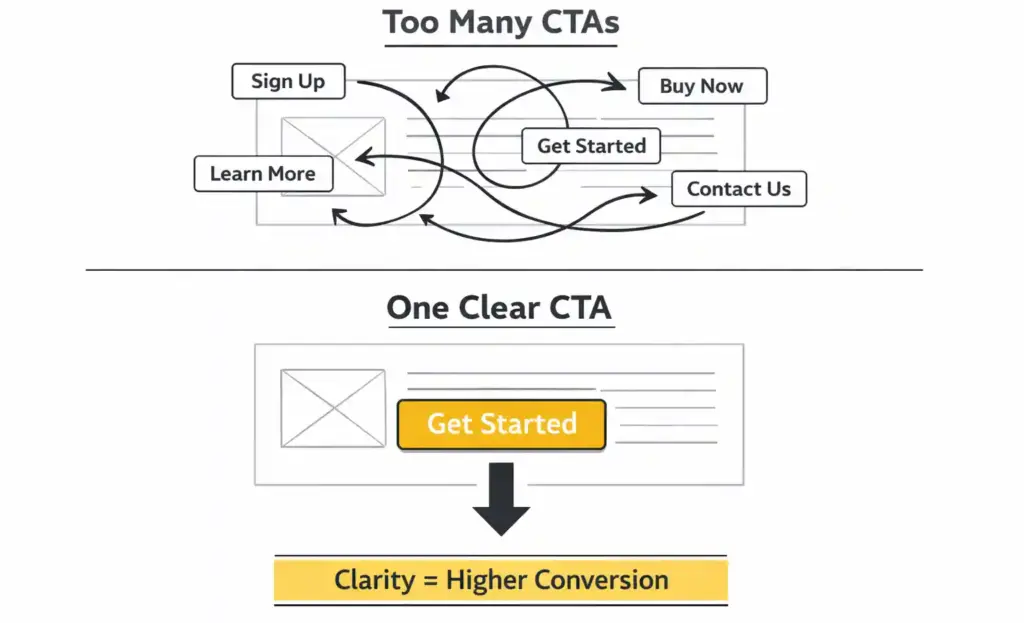
Clarity does not just improve UX. It improves decisions.
A quick check: How many actions are you asking your user to take right now? Count your CTAs. If it is more than one primary action, you are splitting attention.
Simplifying this one element can lift conversions significantly.
4. Design That Directs, Not Decorates
Design is not decoration, but direction.
Your layout should guide attention, not impress designers.
What works now?
- Clear section breaks
- Contrast-driven CTAs
- Intentional whitespace
- Visual flow (top → mid → bottom)
A good test: If you blur your page, can you still see where to click?
That is a real landing page design for conversions!
5. Mantra of a Direct Response Digital Marketing Agency: Trust Is the Shortcut
Before users act, they look for signals: “Has this worked for others?”
Add:
- Client logos
- Real testimonials
- Case snapshots
Example: “Reduced CPL by 42% in 60 days”
This is where a direct response digital marketing agency stands out, because results are visible, not claimed.
6. Structure = Conversion Psychology, Not Content Blocks
Your page is not sections, but a flow of persuasion.
The best-performing pages follow: Problem → Agitation → Solution → Proof → Action
People don’t convert because your page looks good. They convert because it guides them.
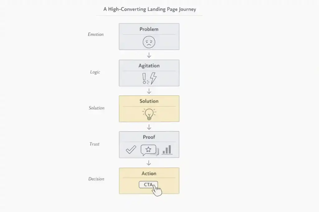
Whether you notice it or not, every high-performing page follows a structure.
Check your flow: Do you clearly move from problem → solution → proof → action?
If the flow is broken, conversions drop, no matter how good your design looks.
What is trending today?
- Short, punchy sections
- Scroll-triggered engagement
- Conversational flow
7. Mobile Is Not a Version. It is the Default.
Over 70–80% of landing page traffic is mobile.
So, fix this:
- Thumb-friendly buttons
- Short scroll sections
- Sticky CTA
- Fast load
Did you know a 1-second delay can drop conversions by 7–10%?
Your landing page is not experienced on desktop, but mostly on mobile phones
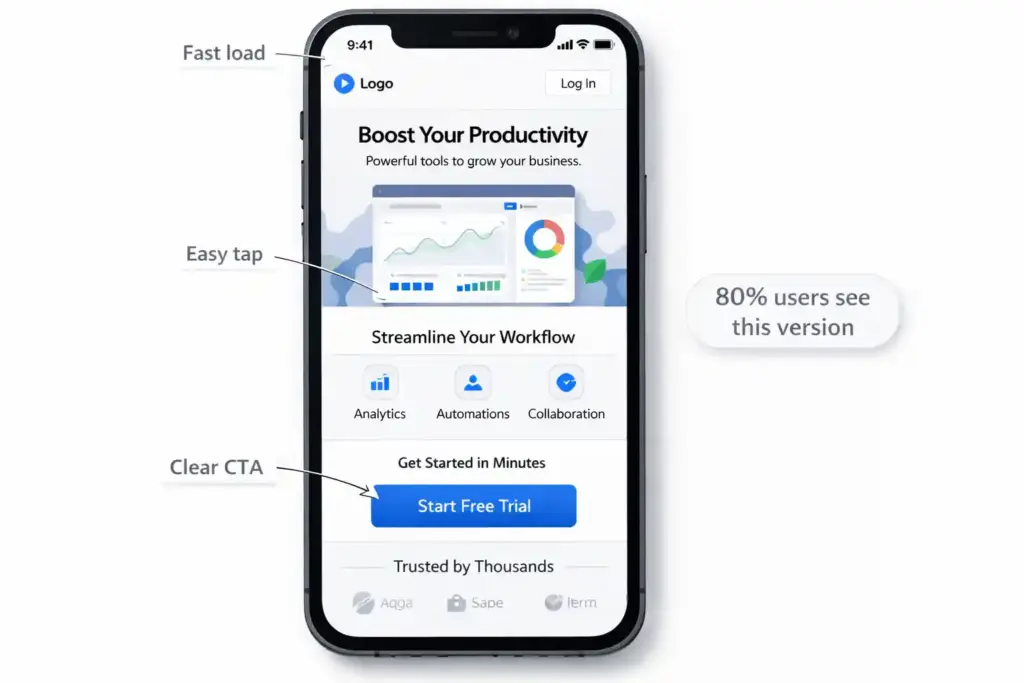
Most users never see your “full design”, only this version. Open your page on your phone right now. Does it feel easy or overwhelming?
Check 3 things: Tap ease | Scroll length | CTA visibility
If on mobile, it does not work; your entire funnel is leaking!
8. Speed = Revenue (not just performance)
Slow pages do not just annoy users; they kill intent!
Here is what matters:
- Optimized images
- Clean code
- Strong hosting
Tip: Design-heavy pages often underperform because they ignore speed.
9. A/B Testing: The Real Growth Engine
Your first version is never the best version!
Your landing page is not a project. It’s a system, so test:
- Headlines
- CTAs
- Layouts
Did you know that even small changes mean 20–40% improvement?
RELATED: Secrets from a digital marketing agency about ad spends and broken funnels
20+ in-house and
remote employees
100+ pan-Indian and
International clients
End-to-end
agency capabilities
20+ strong
industries served
In-house
studio
Helping start-ups
& IPO ready brands
10. Strategy > Design, Always!
Most digital marketing agencies can only build pages that look good. But only very few build pages that convert predictably.
That is where landing page design for conversions becomes strategic because it addresses:
- Funnel alignment
- Message clarity
- Audience intent
11. A Marketing Company in Chennai Can Compete Globally. How?
A marketing company in Chennai, like the Bumblebee Branding Company, operates with:
- Global benchmarks
- Local understanding
- Faster execution and
- Varied clientele expertise
Because we build for response, not recognition
Most businesses don’t have a traffic problem. They have a conversion leak.
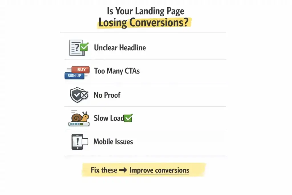
These are the exact gaps where most landing pages lose leads. How many of these issues exist on your current page?
Score yourself:
0–1 → Strong
2–3 → Needs improvement
4–5 → You are losing serious conversions
If you are seeing 2 or more of these, then understand that it is already costing you leads.
Quick Reality Check
Before you move on:
- Does my landing page clearly say what my brand offers, in 5 seconds?
- Is there only one clear CTA?
- Do I show proof or just claims?
- Is my page built for mobile-first users?
Well, if your ‘maybes’ were more than two, then there is a conversion leak.
The 2026 Trend: What High-Converting Brands Are Doing Differently?
- Short-form sections
- Interactive elements
- Real performance metrics
- Human writing that strikes a chord
Your brand has to travel from “Here’s what we do” to “Here’s what you’ll get”
FAQs
What does it take to build high converting landing pages?
Clarity, single CTA, strong value proposition, trust signals, and speed.
How many CTAs should a landing page have?
One primary action.
Why is landing page speed important?
It directly impacts conversions.
Do I need a separate landing page for ads?
Yes, message match matters.
What does a direct response digital marketing agency do?
Focuses on measurable outcomes like leads and conversions & not just building fancy sites.
Final Thought
A landing page is not a page. It is a moment where someone decides whether to trust you.
Most brands treat it like design. But remember, the best treat it like strategy + psychology + performance.
Want to build one that actually converts? Work with an adept direct response digital marketing agency like the Bumblebee Branding Company that focuses on performance, not just design.